
10 years after the project started, the HdM-designed Museum of Cultures (Museum der Kulturen) in Basel finally opened its doors last month. The design reorganized the the entrance, the existing building facade, and added a cute little new roof with hanging plants. The formerly closed Schürhof courtyard was turned into a public space directly accessible from the Münsterplatz.


At the heart of historic Basel, it's a rule that no new construction should be seen from public streets. The geometry of the extension was thus carefully calculated according to various view angles. Only visible from above or from the inner courtyards, the ceramic-tiled folded form exists in harmony with its neighboring roofscape.


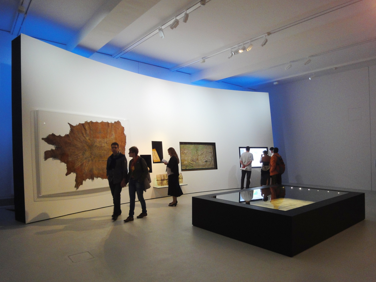
HdM provides neutral gallery spaces for the Museum's 300,000+ ethnographic artifacts, representing cultures in all continents. But the exhibition design is horrible - weird curved walls and folded table surfaces here and there, unrelated objects putting on the same table in a very loose manner. Underneath the folded roof is a large column-free gallery space, but the exhibition designers put in walls winding throughout the hall, blocking any possible perception of the grand space! Probably the only thing I found interesting was the the paper Chinese dragon in a red double-height room.


This reminds me of another recently-opened museum, the Cité de l'Océan et du Surf in Biarritz by Steven Holl. It has a rather curious shape, vaguely resembling waves and the boulders along the Atlantic coastline in Biarritz. The building is pressed half underground beneath a curved roof that forms a public plaza with theatrical sequence of topographic changes. A gentle stairway leads up to the plaza level from the street front of the building. Both sides of the plaza curve up, flanking the ocean view towards the horizon in the distance. On one side, the plaza rises to a terrace. On the other side, the plaza slopes down onto the ground, leading to a grassed park onward to the vast ocean. On the plaza, people run, climb, and jump, as if the “monkey side” of Homo sapiens were released by this dramatic form. At the southwest corner there is a skate pool for the surfers’ experiments. The cloud shape indentation also forms a strangely compressed portico to the auditorium.


Under the high corner of the curve on the roadside is the entry lobby to the exhibitions. The steep sloping ceiling intensifies the spatial indication of diving down to the semi-underground exhibition space.


As I descended the stairs, I almost cried out loud OMG! "Am I in Disneyland?" The exhibition designers had ruined the poetic space with their amusement-park-like "edutainment" installations. A splash of water that looks like a whale as "the cradle of evolution"? Rocks with colorful videos inside? Grotesque machine arms for projection? Oh boy...


It seems nobody has learned a lesson from the disastrous interior of the Jewish Museum in Berlin. The chaotic exhibition arrangement completely destroys the architectural space by LIbeskind. Zigzag? Warped Star of David? Gedenkbuch? I don't see any of those from the inside!

It's quite disheartening that architecture and exhibition design seldom go hand in hand with each other in contemporary museums. The limited influence of the profession has forced many architects to either ignore the content or just go for the generic white box. We should wake up and start to break the line between architecture and exhibition, and advocate for a more holistic design for the shell, the space, and its contents.
No comments:
Post a Comment